Two years ago I made a post that featured a dozen or so maps and graphs that lended insight into global warming. It turned out to be one of the most read pages on my site. I now want to update that page with even better and a larger number images which are relevant to climate change. They will feature only very brief explanations. Most of what is being shown is self-evident, but if you have questions, feel free to ask them. Hopefully this can serve as a good reference for those who want some images relevant to global warming. I also recommend the site http://www.globalwarmingart.com. These images can all be clicked on for enhanced view. I am also happy to take further suggestions and them.
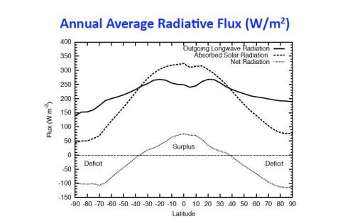
The global climate system is ultimately driven by the radiative balance at the top of the atmosphere and surface energy budget terms. Heat flows from the warm surface to the cold atmosphere and from the warm tropics to the cold equator to help eliminate the gradients that would be produced by radiation alone. The first image below shows the globally and annually averaged heat fluxes. The second shows the latitudinal distribution of solar and terrestrial heat fluxes.
Trenberth et al 2009
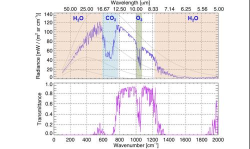
For understanding the greenhouse effect (see here) we’re interested in the ability of various atmospheric gases to retard the outgoing infrared energy exiting the planet. We can see how these gases takes “bites” out of the outgoing spectrum (this is upwelling infrared, as would be seen for example by a viewer from space) and thus makes the planet a less effective emitter at a given temperature. We can also look at transmittance, which is essentially one in”atmosphere windows” or zero in strongly absorbing regions.
We can look at the same effect in terms of “brightness temperature.” This is an inverted form of the Planck law. It is noteworthy that in regions where gases do not really absorb strongly (say, 8-12 microns) that a viewer looking from space would see radiation coming from the surface, at the hot temperature of the surface (close to 290 K). In strongly absorbing regions, a viewer from space does not need to look very far down and will see radiation emanating from higher, colder parts of the atmosphere.
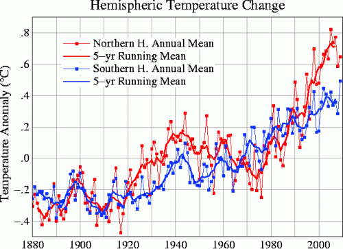
Of prime importance to us is increases in global temperature. A fairly standard time-series showing the evolution of temperature anomalies (i.e., the departure from some arbitrary mean value, in this case the 1951-80 climatology) is:
This can be decomposed into hemispheric contributions, as seen below:
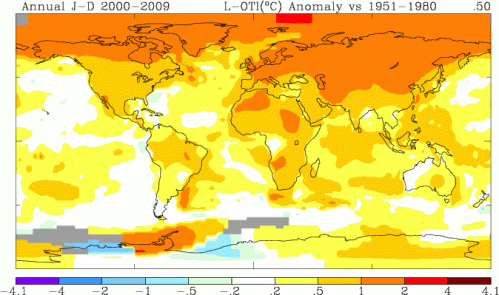
These images were obtained from the NASA GISTEMP page, as are some sample outputs produced below, which show a global map of temperature anomalies so that one can see the zonal and meridional structure of global warming.
This plot is for 1995-2009 anomalies relative to the 1951-1980 mean.
And a 2000-2009 anomaly map
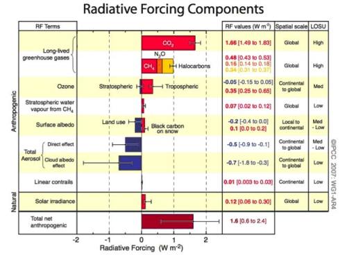
In understanding this temperature rise, we are interested in the radiative forcing of various agents, such as fluctuations in greenhouse gases, anthropogenic aerosols, solar flux, and volcanoes. Radiative forcing is a useful tool to compare the influence of different things on a side-by-side basis:
http://www.yaleclimatemediaforum.org/pics/0108_radiative_forcing.jpg
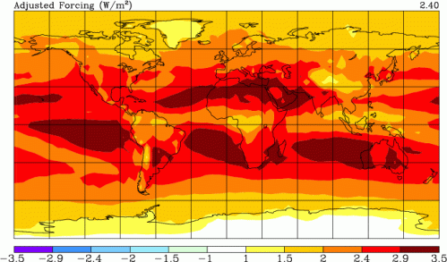
Positive forcing indicate warming influences, and negative forcings, cooling influences. More detail here. As we can see, aerosols have done a considerable job at offsetting greenhouse warming, but they also have a lot more uncertainty associated with them. There are some examples of the global distribution of radiative forcing. For instance, a model output of the RF from CO2 from 1880-2000 reveals that the RF is not completely uniform over the globe
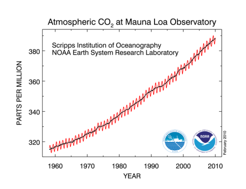
This is a result of the increase in CO2 over industrial time, plotted below
http://www.esrl.noaa.gov/gmd/ccgg/trends/#mlo_full
There is a very clear upward trend in CO2, as well as a beautiful annual cycle associated with the disproportionate vegetation responses between hemispheres over a year. We can see a human-induced fingerprint in the rise of atmospheric CO2 by looking at the decline of oxygen, which is a result of combustion, as well as a decline in C13/C12 ratio which is consistent with burning fossil fuels:

IPCC 2007 chapter 2, thanks to Jim Eager for suggestion
To-date and projections of future CO2 emissions are below in GtC yr-1. We are currently tracking on the high end of various economic scenarios:
Copenhagen report, 2009
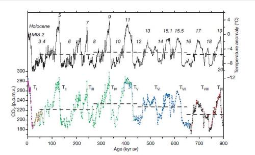
pCO2 can be reconstructed from the trapped air in the bubbles of ice cores in Antarctica (they do not currently use Greenland for CO2, maybe some hope in the future), but the longest record in ice cores can go back 800,000 years.
Luthi et al 2008, Nature
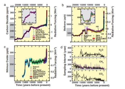
Currently, CO2 concentratios are at 390 ppm, much higher than at any time in that record. This can also be put into the context of radiative forcing over long periods of time. For example, this plot shows the evolution of concentrations and the RF from CO2, methane, and nitrous oxide over the last 20,000 years.
Joos and Spahni, 2008, PNAS
Over the last 400,000 years, we can look at the evolution of concentrations and forcing, as well as sea level.
Hansen et al 2008
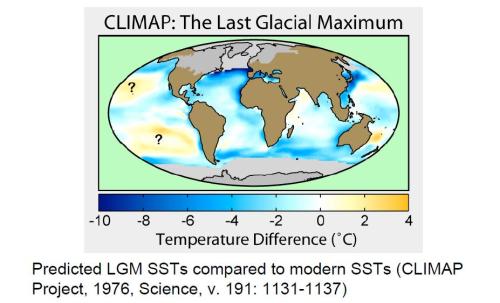
Here is the CLIMAP reconstruction of surface conditions of the LGM oceans relative to modern SST’s.
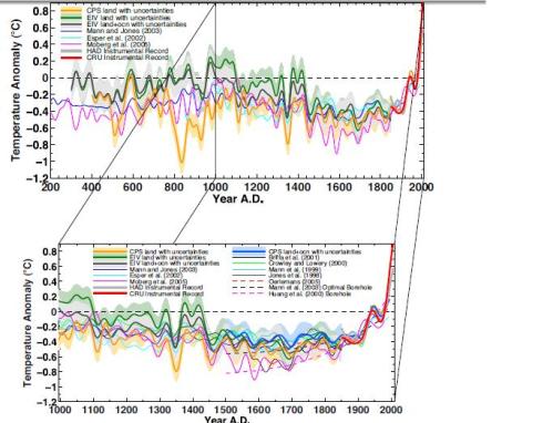
This plot is current best estimates of Northern Hemisphere temperatures over the last few millennia,
Mann et al 2008
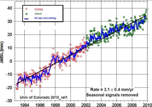
The sea level rise over the last few decades is also large, coming in at over 3 mm yr-1. Here is a plot showing a recent time-series of sea-level rise with the seasonal cycle removed
see http://sealevel.colorado.edu/
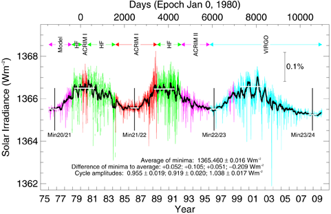
As we’ve seen, greenhouse gases are the largest radiative forcing agent since pre-industrial time. Other things do matter though, and studying them is important. Here is a plot of solar intensity over the last few decades:
see http://www.pmodwrc.ch/pmod.php?topic=tsi/composite/SolarConstant
There has been essentially no secular trend in solar irradiance over this time, although there is a clear ~11-year cycle.
This is an interesting figure showing the amount of CO2 taken up by the oceans to 1994. The interesting thing to note is the North Atlantic, which represents a relatively small area of the global ocean, has taken up a disproportionately large amount of carbon (25% of inventory with 15% of area)
We can also get a feel for the penetration depth of CO2 in the ocean. Because the ocean mixes slowly, most of the CO2 is in a relatively shallow region. The deep mixing in the North Atlantic, which explains the phenomena is the preceding figure, is evident here:
Mauri Pelto has suggested some of these images of glacier mass balance over time:
http://www.nichols.edu/departments/Glacier/global%20glacier%20mass%20balance.htm
http://www.nichols.edu/departments/Glacier/global%20glacier%20mass%20balance.htm
http://www.nichols.edu/departments/Glacier/global%20glacier%20mass%20balance.htm
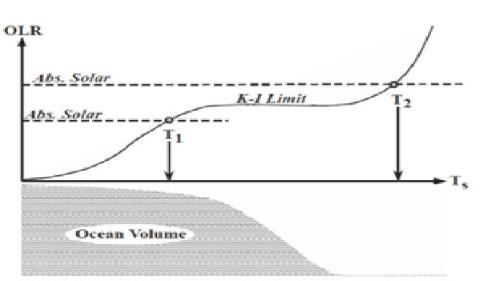
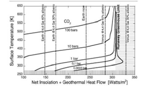
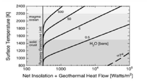
The rest of these images I just have for making them clickable somewhere else, sorry for lack of descriptions
Bifurcation diagram for temperature vs. CO2 (Pierrehumbert et al, 2011)

Modeled changes in a atmosphere free of non-condensing greenhouse gases (CO2, methane, etc, Lacis et al 2010)

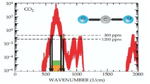
CO2 Absorption features showing non-saturation
These following graphs have no physical significance…I’m placing them here for a bookmark only, do not cite:







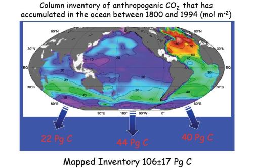

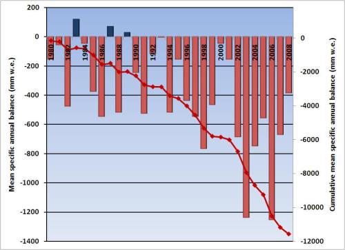

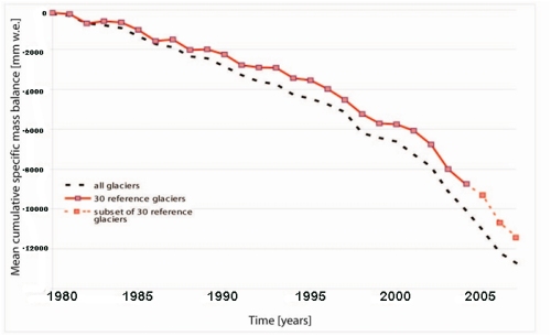





Great column inventory graph for CO2. How about a graph of glacier mass balance. For this years BAMS State of the Climate 2009 I submitted Figure 1 and 2 from here, that will be in the Glaciers and Ice Sheets chapter.
http://www.nichols.edu/departments/Glacier/global glacier mass balance.htm
Great to have these all in one place : Thanks.
If you are looking for suggestion for any more that could be useful, I would suggest those showing ice trends at CRYOSPHERE TODAY :
Too funny. I knew there is no way you’d be able to resist those discredited Mann 2008 hockey stick graphs.
Response– Sorry, random blog musings from a web page that can almost never get a thing right is hardly discrediting.– chris
It is discredited. No one but you and Mann are claiming the Tiljander series used to create that graph aren’t inverted. Your ad hominem attack against WUWT while sidestepping the actual issue of validity of the data leads me to suspect that you know the graphs are bad but used them anyway.
There is no shortage of climate scientists who I can cite on this, but possibly the most damning, and one I feel most sorry for is D.S. Kaufman. He used the data as inverted by Mann in Kaufman et al 2009, and started getting questioned about the Medieval Cold Period and Little Warm Age in his graphs. After looking into it, he published the following correction:
“[The] 4 [Tiljander series] were corrected to conform to the interpretations of the original authors”
Click to access Correction_and_Clarification.pdf
Response: This issue has been discussed ad nauseum at Stoat and elsewhere. I am not interested in a hockey stick conversation. Suffice to say that Mann et al. were very much aware of the issues raised by the WUWT-CA crowd and that their conclusions do not rest upon them, and reconstruction over the last 1,000 years is in general agreement with the pattern concluded by various other authors. You seem to be blinded by baseless attacks from bloggers who don’t understand what they are talking about, and my not feeling the need to address them is hardly worth talking much about. You also need to look up what an ad hominem is, I’m just telling you that based on where you get information from, you do not at all care about the actual issues. I personally have issues with the constant bombardment of spurious criticisms, unchecked attempts to destroy the credibility of very good scientists, and the general aim of spreading confusion.
If you don’t like the science on this subject to date, then do your own, and get it published in a proper fashion. But don’t post bulls**t here. On this topic, unfortunately, it is you that has the issue upside down That is all the comments I am putting up on the “hockey stick” which still stands. –chris
Bryan, try and look at the reconstruction when removing Tiljander, it is in the supplementary material.
It changes so little, that even *if* it was upside down, it would not matter.
Second that, Marco. The best that McIntyre and Watts could come up with is one proxy is inverted? When McIntyre complained about that issue, he KNEW that it did not matter. Mann et al. did the reconstruction without that proxy (and a few others listed in the supp material) and it did not significantly change the shape.
Notice that the anti-science crowd keeps crowing on and on about MBH98/99? They have to because Mann et al. (2008) shows the same shape and all of the data and methodology appear freely online.
The very first graph is a classic. What does a photon “see” when it approaches the upper layer of the atmosphere? Water, trees, and clouds. Of the 160 w/m^2 absorbed at the surface virtually all of it ends up absorbed by water, either instantaneously, or within a very short time(minutes to a day or so) as latent heat and heat of vaporization. That heat takes a relatively long time to work its way up to the -19 degC level where it is finally emitted as radiation, eo balance the equation.
How long does it take longwave infrared to travel from the ground to the same altitude? Just on the face of it, since the radiation travels at much higher velocities than the physical movement of molecules and liquid water, the time constant has to be orders of magnitude faster for radiation.
So, what are the primary mechanisms that slow the transfer of energy from the surface through the atmosphere? It can’t be radiative transfer. It has to be primarily physical mechanisms involving water.
The graph shows the surface absorbing 161 Wm-2 directly from incoming solar radiation. However, it also shows 333 Wm-2 absorbed from back radiation. So, the total radiation absorbed by the surface would be (161+333) = 494 Wm-2.
The surface emits heat in the form of thermals, evaporation, radiation to clouds and radiation directly to outer space (17+80+356+40) = 493 Wm-2. In other words, there is a slight warming of the surface.
40 Wm-2 travels at the speed of light to outer space; it amounts to about 8% of the total. So, the remaining 92% of the energy is caught up in thermals, back and forth radiation, and phase changes.
It is way beyond my skill set to calculate exactly how long it takes the 92% to eventually be emitted. However, there is likely a range of times (a distribution) for all the photons involved and conditions to be considered. Considering how quickly the earth cools off during at night, I’ll make something of a guess that most of the energy in the atmosphere would be emitted within 2 or 3 days.
There isn’t much issue with the speed of photons through the atmosphere; what matters in the effect of radiation is the rate at which they are emitted and the rate at which they are absorbed.
I made some graphs with all three surface temperature records (GISS, HadCRU and NCDC), for use in a presentation. That way one can avoid the charge of having picked a temp series that best suits a particular argument.
See http://ourchangingclimate.wordpress.com/2010/03/01/global-average-temperature-increase-giss-hadcru-and-ncdc-compared/
With regard to ‘hockey-sticks’, here are more graphical confirmations :
Committee on Surface Temperature Reconstructions for the Last 2,000 Years, National Research Council
http://books.nap.edu/openbook.php?record_id=11676&page=17#p200108c09960017001
NOAA/IPCC
http://www.ncdc.noaa.gov/paleo/pubs/ipcc2007/ipcc2007.html
More maps:
http://www.skepticalscience.com/Was-there-a-Medieval-Warm-Period.html
and graphs:
http://www.skepticalscience.com/Could-climate-shifts-be-causing-global-warming.html
Quick note to Bryan on Kaufman’s correction:
“The original conclusions of the paper have been strengthened as a result.”
“Patrick 027 said
March 4, 2010 @ 2:12 pm
There isn’t much issue with the speed of photons through the atmosphere; what matters in the effect of radiation is the rate at which they are emitted and the rate at which they are absorbed.”
This is an important point for which there is no chart above.
I think it is not correct to keep describing IR photons as being “trapped” by GHGs. They still escape back into space within a few days. The extra GHGs we have added just delay the escape by a few minutes.
Actually, no they don’t escape. The energy does escape via new photons that are eventually emitted. But what happens is GHGs block a portion of the emitted photons from escaping. The energy eventually escapes, but new energy (solar heating) is continually added (averaged over time), so what happens is the temperature rises, this increases the emission of photons, and THAT is what allows the energy to escape at the same rate as before. (and some feedbacks and other complexities, etc.)
Chris, it might be good to add the plot of atmospheric O2 decline to go with the Mauna Loa plut of CO2 increase.
oxygen_13c is fuzzy.
I guess http://en.wikipedia.org/wiki/File:Pliocene_megabiome.png can’t be incorporated since it’s not a direct measurement, but a model result.
for comparison, current biomes: http://upload.wikimedia.org/wikipedia/commons/2/25/Kasvillisuus.png (in finnish, the english version lacks the legend)
obviously ‘grasslands’ in the pliocene image incorporates a wide variety of biomes divided in the holocene map.
Some nice discussion of your oxygen depletion & δ13C lightening here:
http://www.rocketscientistsjournal.com/2010/03/sgw.html
Regarding SLR… the graph of SLR with the seasonal signals removed had led some to assume a false precision in the measurement. I find the graph of SLR with barometric pressure adjustment, and with the seasonal cycle shown, is less apt to be interpreted incorrectly. There was a load of nonsense in late 2008 and early 2009 about SLR leveling, but the current measurements are back above the long term trend line, and just about where one would expect in an El Nino year (measured SLR accelerates in El Nino years, and decelerates in La Nina years). I suggest that you switch to the other graph.
Regarding the graph of energy imbalance in watts per square meter versus latitude: the graph is a bit mis-leading because some might look at area under the surplus curve and compare it with the area under the deficit curve. Since there is less area at increasing latitudes in both the SH and NH, the integrated energy imbalance would show much larger deficits, and smaller surpluses.
I think the Trenberth plot of energy imbalances is really good, but hard to understand w/o study. There is a plot showing heat absorption in the oceans over time, versus heat absorbed in the atmosphere and heat that melted ice, that is much easier to understand, although the accuracy may be uncertain. This display clearly shows ocean heating is the dominating AGW effect. But lack of good data with this heat balance issue led to Trenberth’s “… its a travesty we can’t.” comment, so often mis-interpreted.
But this heat balance is a key response to a lot of skeptical talking points, and hopefully, over time, better closure on the heat balance will help reduce the uncertainty in the energy imbalance.
But a really good idea to show all these in one place.
My comment submitted before, show that it is still awaiting moderation…
I did make a mistake in the comment, so if it does get posted, the line about integrated balances should read “Since there is less area at increasing latitudes in both the SH and NH, the integrated energy imbalance would show much larger surpluses, and smaller deficits.”
“But this heat balance is a key response to a lot of skeptical talking points, and hopefully, over time, better closure on the heat balance will help reduce the uncertainty in the energy imbalance.”
So, just which particular ‘heat balance’ and what particular degree of ‘better closure’ would that be?
ISCCP-FD?
NRA?
JRA?
Trenberth et al., 2009?
Loeb et al., 2009 (both ‘old’ balance and ‘optimal’ balance)?
K&T97?
Even worse, what if there really is no such thing as an actual balance (other than a brief instance in time) and they are in effect ALL correct as budgets as cloud cover and Bond albedo drifts around like, say, this:
https://www.yousendit.com/download/bFFNbGtDeFVFd2RjR0E9PQ
Now that would be ……a key response to a lot of alarmist talking points…..!
Regarding Trenberth et al. 2009., i.e. your very first figure above. I note that Trenberth et al. 2009 kindly provide us with all the key data for the:
* ISCCP-FD
* NRA
* JRA
and Trenberth, Fasullo and Kiehl, 2009
‘global mean heat balances’. Presumably these reflect the ‘slop’ in the state-of-play of our ‘best’ available understanding of the mean global heat balance from the last decade.
So, let us just try plotting the ratio OLR/ASR (OLR/Y) versus Albedo % (A) for these 4 analyses studies of the March 2000 – May 2004 CERES period satellite data set.
Oh, I nearly forgot, BTW, just for the fun of it, I also threw into the correlation the old K&T97 numbers for good measure (i.e. OLR/ASR = 1.0; Albedo (A) = 0.313) from the February 1985 – April 1989 ERBE satleiite dataset.
You will then get a curve of the type:
OLR/ASR = 0.0052A^2-0.3197A+5.9014
and R^2 = 0.9940 (gadzooks)
Holy cow!
Are they trying to (subtly) tell us that for just about all % Albedo on either side of a minimum in this curve at A ~ 30.7%±0.5% the ratio OLR/ASR is >1.000 and hence the system is naturally ‘air conditioned’?
Wouldn’t that be nice!
To add to the endless back and forth about the tempt today as against the MWP. Just look at the now non existent Chacaltaya Glacier above La Paz in Bolivia. At 18,000 years of age it obviously survived the MWP but is now vanished completely. Doesn’t that tell you something.
In my opinion the radiative transfer theory puts in the following inconsistencies when deals with planetary atmosphere.
1) It firstly contradicts the second law of thermodynamics assuming that thermal radiation (heat) flows spontaneously from a molecule at lower temperature to a molecule at higher temperature (feedback radiation).
2) Moreover one estimates the atmospheric CO2 15 microns irradiance adopting, with extreme easiness, the black body radiation laws (Plank, Stefan-Boltzmann, Kirchhoff) as if its thermal radiation is both always and however possible at any temperature.
We know very well that the radiation at 15 microns pertains to a precise vibrational resonant frequency of the CO2 molecule. On the other hand we also know that the CO2 molar heat capacity at constant volume, at atmospheric temperatures, is around 2.5*R (R is the universal gas constant) or rather that such molecules still behave in practice as rigid bodies since the collision intensity with the other molecules, due to the thermal random motion, is absolutely insufficient to start and keep up a meaningful vibrational forced oscillation and to bring it in resonance, that is the necessary condition for photon emission. But then, if there are no forced vibrational oscillations thermically rising, how can the molecules to have a thermal radiation at a vibrational frequency? Why this is possible the CO2 molar heat capacity at constant volume should be at least equal to 3.5*R, value that is reached around a temperature of 700-800 K.
With these two substantial thermodynamic inconsistencies I think that is all wrong, all to start again.
Response: I’m sorry but no. Try an introduction— chris